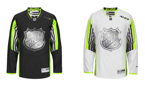
Long rumoured about, and accidentally leaked, the NHL officially unveiled its black and white, neon green accented jerseys for the 2015 All-Star Game.
First impression?

Let’s break it down. Off the top, I can’t say I’m upset with the colour scheme of the set. There is a lot of clamour for jersey designs with brighter colours, and a bit more pop to them, and despite being unconventional, neon green had a chance to bring that. What we got though, was a bland mish-mash of the colours, and jerseys that are dominated by the boring black and white, and barely displays the green. I think highlighted is the perfect word to describe it, mainly because there’s so little green it looks like creative took a highlighter to the jersey and called it a day.
It only gets worse from here though. While the colours had some potential, the design as a whole just falls flat. The lack of bottom stripes gives the jersey the pajama top feel that some teams had upon adopting the Reebok Edge system. Side piping is about as “meh” as it can get, and just what is with the grey and dark grey striping? Colour-wise, it doesn’t really stand out at all, and where it is on the the jersey is just weird. It’s on the part of the sleeve that mostly faces towards the player’s body, who’s going to see it? What other jersey have you ever seen that has its striping there? Hint, the answer is none, because it’s a silly idea. You know what else is a silly idea? Having the stripes run from the armpit to the crook of the elbow, then stop. Did they run out of material, or did they actually do this on purpose, thinking it was a good idea? Either way, it makes the jersey fall flat on its face, if it had one.
What I want to know at this point (because face it, this ugly set is here to stay) is why this design was even considered. Aside from the (very off-kilter) All-Star patch on the left of the breast, this jersey doesn’t scream All-Star at all. Some have called it the “Monster Energy” jerseys, and others are wondering when D-Generation X decided to purchase an NHL franchise. They couldn’t have slapped a few stars on there? Maybe tried not to be so daring with these design choices? ‘It’s forward thinking.’ No it’s not. It’s terrible, and we should be ashamed that this jersey will grace the All-Star Game with its presence.
So what does one do at a time like this? Well, besides write a post ripping the design, one can go and create their own and try to make things better. Bored during the intermissions of Friday’s Leafs-Blue Jackets game, I whipped these two designs up in what probably totaled an hour-and-a-half to two hours work:
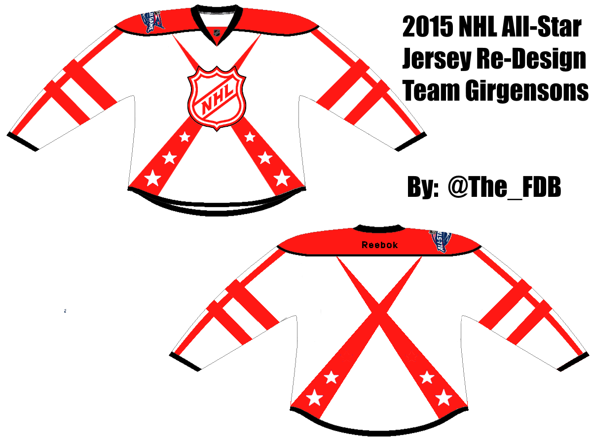
I decided to go with a simple blue, red, and white scheme which was pretty popular in the late 90’s, early 2000’s. Rather than just go with a simple striping that runs around the arms, I added two stripes that ran up each arm to give the jerseys a bit of a different look. I also abandoned the classic bottom stripes in favour of the crossing, spotlight kind of stripes. It’s a different way around accenting the bottom of the jersey, as opposed to the classic horizontal stripes and it gave me a decent place to add the stars, because after all, this is an All-Star jersey. I get a bit of a throwback feel from my design, but at the same time, it’s new enough without being a rip-off.
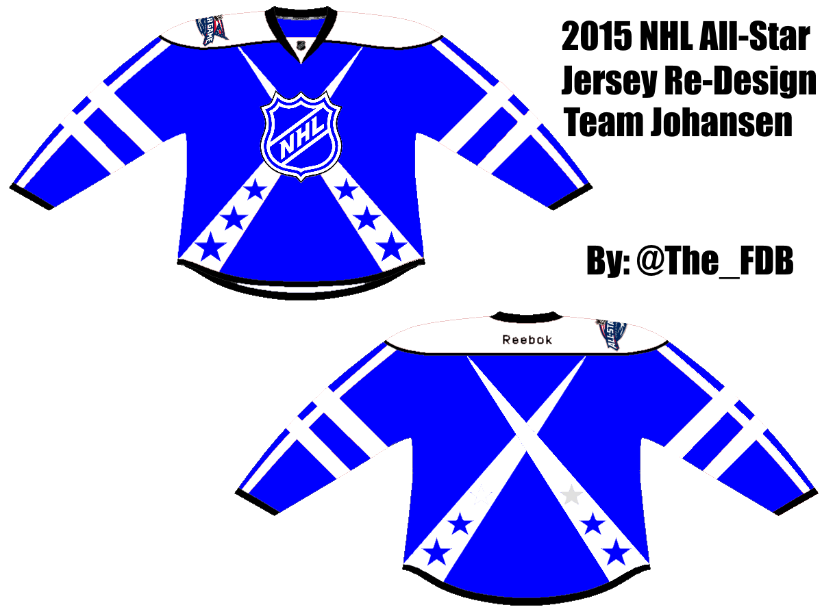
Now I bet some of you are saying that my design was too easy; it plays off a colour scheme that’s already widely accepted, and the design isn’t particularly “out there,” so of course it’s “better.” That’s perfectly acceptable criticism, and I understand your view. Which is why I also cooked up another design using the colour scheme the NHL wanted to go with, and yes, I even used the chrome logo, which many people don’t like.

 Now admittedly, these were a lot harder. It probably took me twice the amount of time to get these ones together than it did the first set, so I do have a bit of respect for people who had to work with this. The Girgensons jersey was pretty easy to get together, as the neon green plays off the black pretty well, and I liked the idea of the stripes running up the arms from the red and blue, but this time, I decided to go with one big single stripe, ‘forward thinking’ and all that. I used the stars by themselves this time to give people something to look at on the bottom of the jerseys, as well as the star on the left of the chest, which would be where the “C” or “A” would go, if applicable.
The Johansen jersey was a significantly harder task, considering playing white off neon green tends to hurt your eyes. Ditching the sleeve stripes, I ran stars up the arms and put a pentagon on the bottoms to give the jersey a bit of a signature look. (Don’t ask my why I used a pentagon, it just looked cool.) I kept it simple at the bottom with the horizontal stripes, but at that point, the jersey looked empty to me. A big glut of white around the logo just didn’t seem to sit right. Taking the ‘star around the “C”‘ idea from the Girgensons set, I took it a bit further and squared the logo up with 4 black stars. It completed the design for me A) because before that point, I felt I hadn’t used enough black and B) I balances out the brightness of the white and green so it doesn’t hurt your eyes.
So there you have it, my thoughts on the set the NHL is going with, and two new designs that mayyyyyybe might be a bit better. Agree? Disagree? Think I’m an idiot? Feel free to let me know, either on Twitter, or in the comments below.
